- Multimedia Design Principles (Balance, Rhythm or Harmony, Emphasis, White Space) - Continue from the last post.
- Typography : Basic Concepts and Principles
- Working With Text
- Typography in Media Design
**********************************
Design Principles
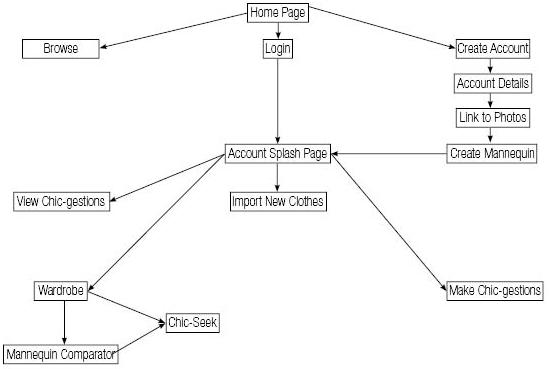
Unity
- Refer to Fakharudin's Blog
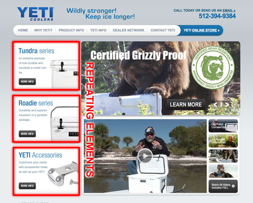
Repetition/ Consistency
- gives your visitors a sense of site recognition and consistency
- Using a repeated logo and keeping the headings, fonts, colors, sizes and styles the same across all pages adds a repetitive continuity that enhances the flow of the website.
- creates continuity and looks professional
Balance
- equal distribution of visual weight in a design. Visual balance occurs around a vertical axis; our eyes require the visual weight to be equal on the two sides of the axis.
- Symmetry :


- formal balance
- also known bilateral balance
- It can also be boring
- symmetry achieves balance through repetition
- Asymmetry


- informal balance
- asymmetry achieves balance through contrast
- to draw attention
- interesting and more dynamic than symmetrical balance.
Rhythm / harmony
- Repeating a series of elements that progressively increase or decrease in size and spacing
- Alternating dark and heavy with light and thin elements
- Repeating similar shapes or elements throughout the layout
- Presenting consistent elements in the same position of every page throughout a site

Emphasis
- Refer to Syakirah's Blog, Hazani's Blog and Fakharudin's Blog
Typography : Basic Concepts and Principles
- Typography is one of the most fascinating elements of graphic design. If it’s web design, album art, posters, or any other type of graphic design, typographical inspiration can be a great. (Tipografi adalah satu elemen yang menarik dalam rekabentuk grafik. Dalam rekabentuk web, album seni, poster dan lain-lain, tipografi adalah satu idea yang baik)
- There are some common terms that we use daily with the wrong meaning. Previously, we often using term "FONT" as to refer Arial, Times New Roman, Comic Sans and so on. However, the term should be called TYPEFACE not FONT. (Terdapat beberapa istilah yang biasa digunakan sehari-hari dalam maksud yang salah. FONT bukan merujuk kepada jenis tulisan Arial, Times New Roman, Comic Sans dan lain-lain. Tetapi, ianya patut dipanggil TYPEFACE)
- Instead, FONT refers to Bold, Italic, Underline, Shadow, Strikeout, Subscript and so on. (Manakala, FONT adalah Boldi, Italic, Underline, Shadow, Strikeout, Subscript, size of font dan lain-lain lagi)
- 3 categories of typeface
- Serif - eg. Bodoni, Times New Roman,
- suitable used in the printing document such as typing in Microsoft Word and printing the document. (Sesuai digunakan pada dokumen yang dicetak seperti penulisan dalam Microsoft word)
- it is suitable for that purpose because the typeface seems creating a line underneath and can help us focusing ones attention on the line of words. (sesuai bagi tujuan di atas kerana Serif menampakkan seakan-akan garisan di bawah tulisan dan dapat membantu kita tertumpu pada satu-satu baris perkataan.

- Sans Serif - eg. Arial, Arial Narrow, Tahoma, Verdana
- suitable used in the online presentation such as writing in blog, power point presentation. (sesuai digunakan dalam bentuk persembahan seperti penulisan pada blog, persembahan power point.)

- Decorative - Brush Script, Castellar, Monotype Corsiva
- suitable used as a title, not in a main informational writing (sesuai digunakan untuk tajuk dan bukan pada teks kandungan)

Working With Text
- Layout
- gunakan White Space untuk memberikan emphasis ke atas isi kandungan/ bingkaikan isi kandungan dengan ruang kosong.
- Jangan meletakkan elemen yang terlalu mengalih perhatian terutamanya bersebelahan dengan teks seperti di sidebar.
- Measure (Ukuran)
- Ukuran ini merujuk kepada bilangan karakter dalam satu baris.
- 50-80 karakter adalah memadai untuk satu baris.
- Jika terlalu panjang pengguna akan mengalamai kesukaran untuk mencari permulaan perkataan pada setiap baris.
- Line Height (Ketinggian bagi setiap baris)
- merujuk kepada ruang di antara baris teks.
- Kesesuaian ketinggian adalah 150% daripada saiz tulisan.
- Gunakan ketinggian baris yang lebih panjang jika bilangan karakter yang lebih banyak digunakan dalam satu baris, kerana penggunaan line height boleh membantu mengurangkan kesan sukar memulakan mencari baris seterusnya.
- Visual Hierarchy
- adalah perbezaan kadar penegasan dalam satu paparan.
- Tanpa visual hierarchy, pengguna akan hanya tertumpu pada bahagian yang menarik sahaja.
- Cara yang mudah adalah dengan menjadikan title, heading dan subheading contrast antara satu sama lain dan contrast pada kandungan teks.
- Title (Tajuk)
- Gunakan line height 'tajuk'yang lebih kecil berbanding 'kandungan' = 1.1 : 1.5
- Paragraph (Perenggan)
- Biasanya setiap perenggan dibahagikan dengan white space/ margin di atas dan bawah perenggan.
- Ataupun pada perenggan kedua, permula baris dijarakkan sedikit ke dalam daripada margin kiri.
- Typeface
- Kita boleh menggunakan satu typeface sahaja dalam satu paparan dengan pelbagai font (saiz, weight)
- Jika ingin menggunakan 2 typeface, pastikan terdapat unsur contrast antara keduanya.
- Font Size
- Gunakan saiz font yang besar = 16px atau lebih jika x-height typeface rendah.
- Color (Warna teks)
- Jangan gunakan warna hitam (#000) pada teks kandungan.
- Gunakan warna yang lebih lembut seperti kelabu kehitaman.
- Pada tajuk gunakan warna yang lebih gelap daripada teks kandungan.
- Bertujuan supaya teks kelihatan lembut sedikit pada pandangan mata tetapi masih mengekalkan contrast.
- Text must be concise - not too much sentences and make it short. (mestilah ringkas dan pendek -
- Must use in appropriate way - do not be to much decorative text in Drug Prevention Website, because the motive of website will be seen not in serious situation.