** Designing is putting something with certain reasons
Products of Multimedia/Web Design :
- Information Design - content, strategy
- Developer designs and determines the strategy to present the contents according level of difficulty and the objectives of development.
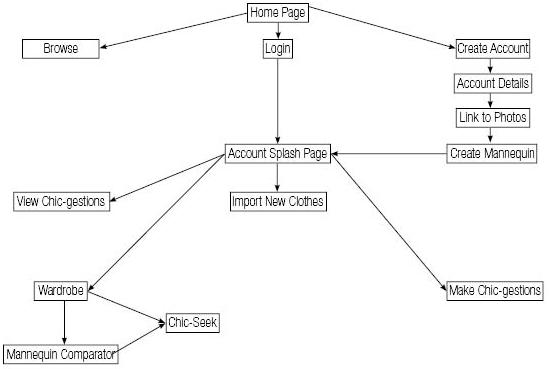
- Interaction Design - Navigation
- Developer designs the navigation buttons and study the navigation issue to develop an appropriate multimedia.
- Interaction design involves
- Consistent
- Visible
- Learnability (meaningful and unambiguous labels)
- Predictability
- Feedback (Acknowledge interaction and provide information about status, progress and so on.
- Interaction Design is not about the behaviour of the interface, it is about the behaviour of people.
- The navigational system combined with content and other contextual cues should help a visitor understand where they are.
- Interface Design - Presentation
 |
| Example of Interaction Design - Navigation |
- also called as Visual Design/ Presentation Design/ UI
- is the design of multimedia/web with the focus on the user's experience and interaction.
- is the process of ergonomically and strategically presenting media in order to communicate a message.
- The goal of user interface design is to make the user's interaction as simple and efficient as possible.
- The design process must balance technical functionality and visual elements (eg. mental model) to create a system that is not only operational but also usable and adaptable to changing user needs.
 |
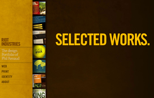
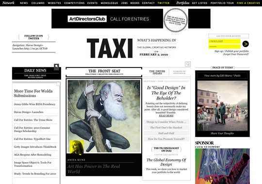
| Example of interface design |
*************************************************
Design elements and principles describe fundamental ideas about the practice of good visual design. Below are the
Principles of Design :
- Contrast
- Unity
- Repetition/ Consistency
- Balance
- Rhythm or Harmony
- Emphasis
- White Space
********
Among the principles of design, I will discuss 2 principles and please feel free to discuss in the comment area.
- Contrast
- also called as difference.
- The greater the difference, the greater the contrast
- Providing variety in the design
- Great contrast can leave a very good impression on a user
- The purpose of contrast in design:
- make a focal point
- add visual interest
- avoid a design to be bland and uninteresting
- However, viewer won't be able to decide what it is important if everything is contrasting.
- White Space
 |
| Contrast in Color |
 Contrast in Size  Contrast in font Bad Example of too much contrasting  |
- White space is the absence of text and graphics. It can help make a layout easy to follow, highlight a certain element or help rest the eyes.
- White space is always an active element in any good design; it’s also referred to negative space.
- White space doesn't mean it has to be white because it can be any colour whether it is black, brown or white
- The purpose of white space in design :
- Rhythm : allows the reader to easily engage the design without being confronted with too many graphics or type
- Shapes of letters can be distinguished and uncomplicated.
- A lack of text or images creates a more balanced visual interpretation and can help focus ones attention on the main article
- Allows breathing space and is an essential factor in design.
- A lack of white space creates confusion and turn peoples attention off of your design

Bad Examples of without white space in design

*****************************************************
Bibliografi :http://www.webdesign.org/web-design-basics/design-principles/what-is-white-space.10284.html
http://webdesign.tutsplus.com/articles/using-white-space-or-negative-space-in-your-designs--webdesign-3401
http://tv.adobe.com/watch/classroom-five-essential-principles-of-interaction-design/part-2-interaction-design-navigation/

No comments:
Post a Comment